

Stunning Family Rebranding
Branding
Brand strategyKey visual system
Application design
Client
STUNNING
Date
2022 slowalk project
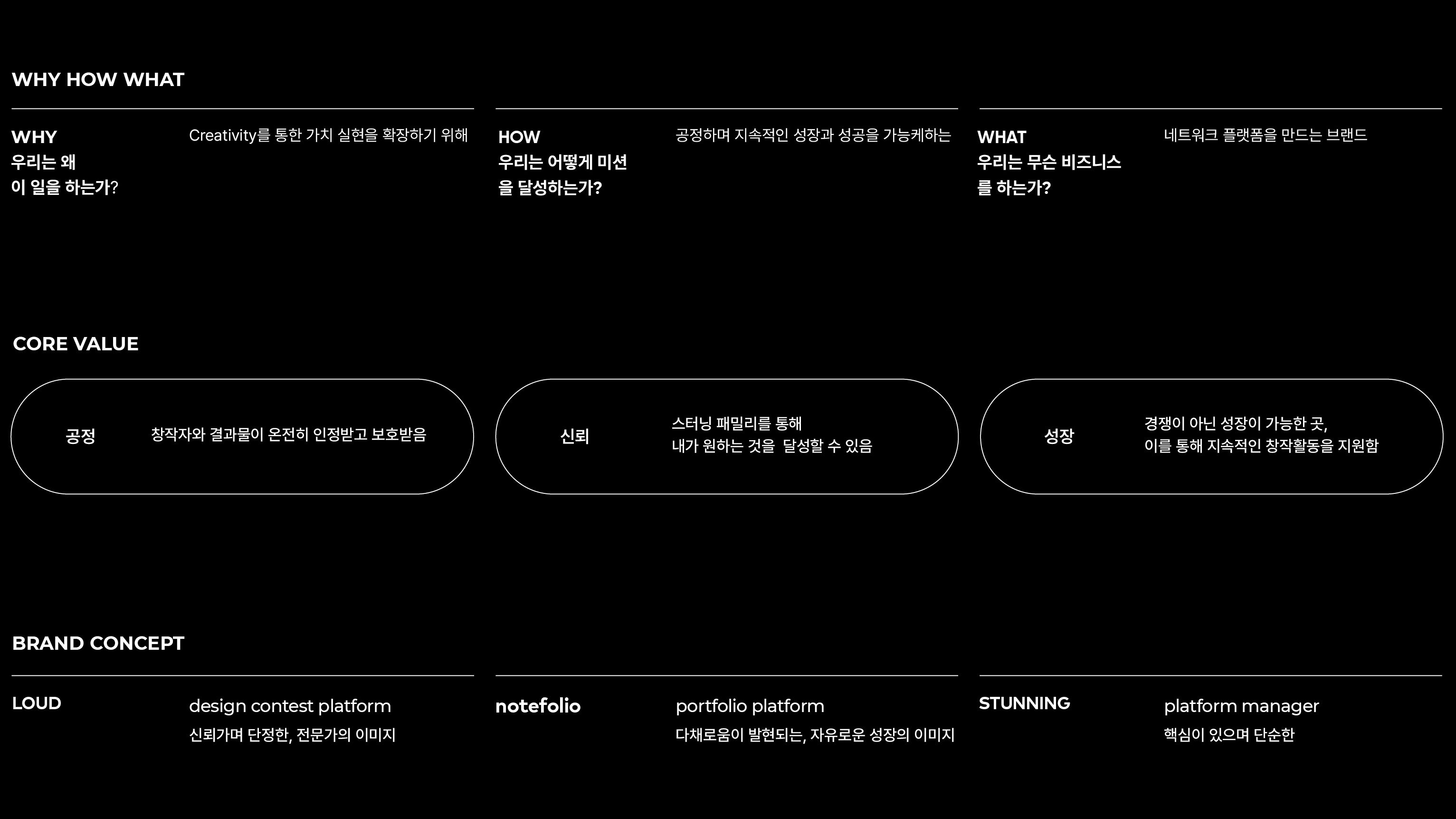
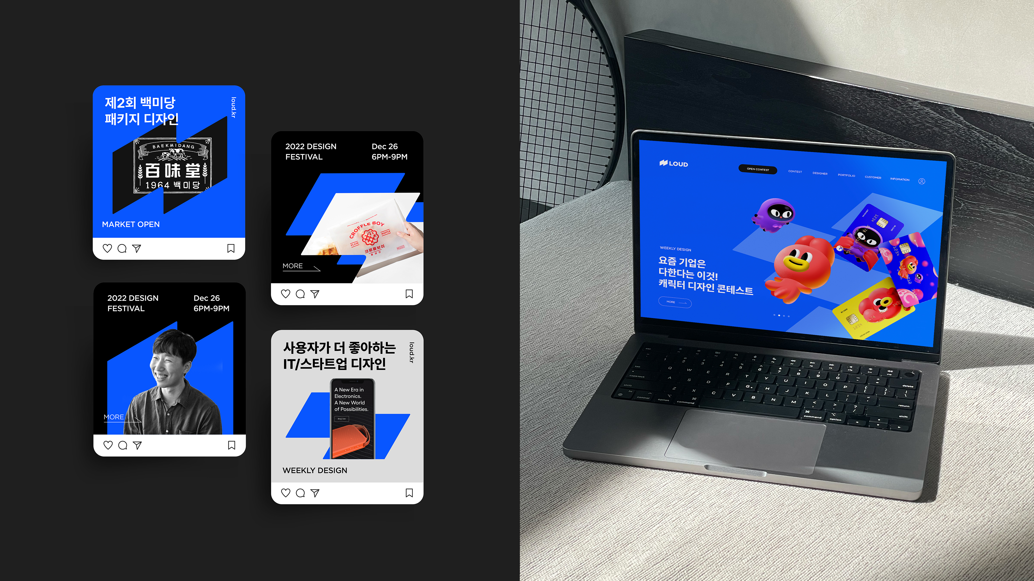
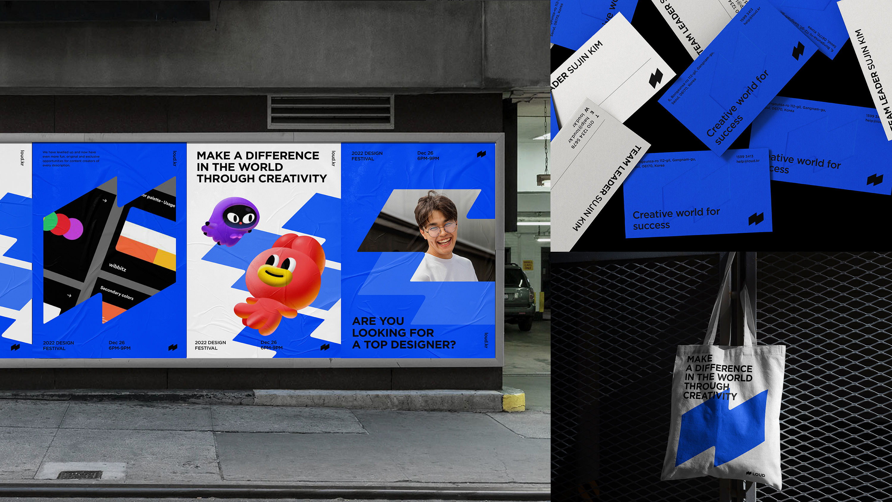
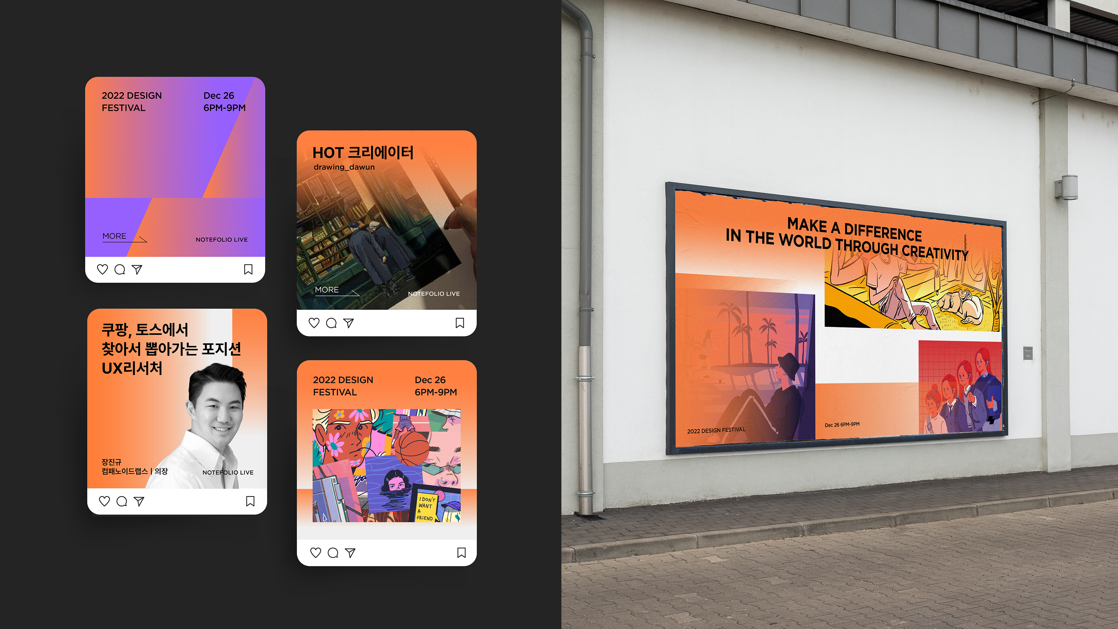
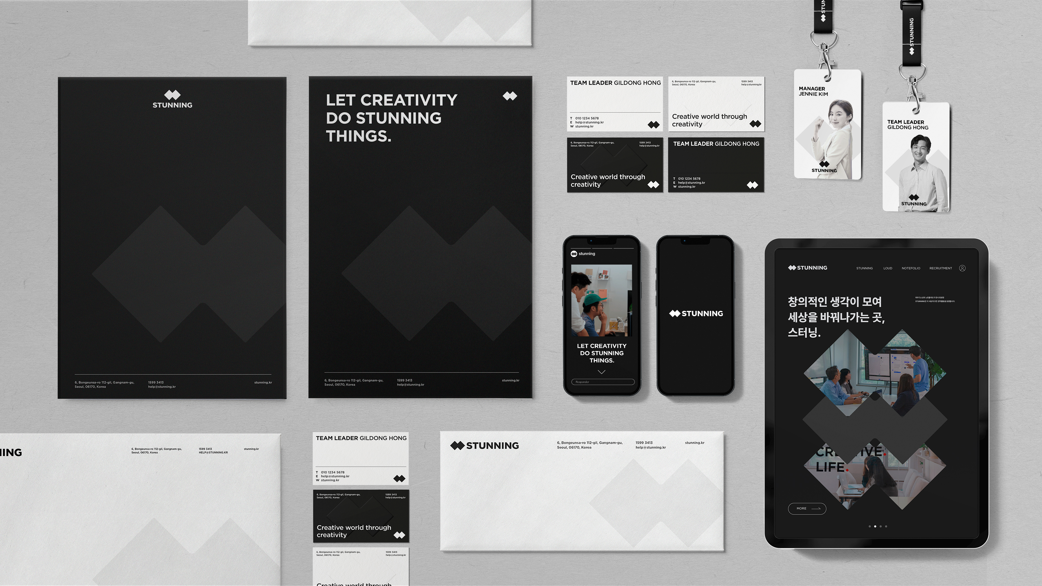
스터닝 코퍼레이션 리브랜딩은 디자인 콘테스트 플랫폼인 ‘라우드', 포트폴리오 플랫폼인 ‘노트폴리오', 두 플랫폼을 관리하는 회사 ‘스터닝' 3개의 브랜드를 하나의 브랜드 패밀리로 만드는 작업입니다. 스터닝 코퍼레이션은 예술 및 디자인 분야에서 활동하는 젊은 창작자들을 지원하고, 이들이 성장할 수 있는 생태계를 만들고자 하는 조합입니다. 3개의 브랜드를 브랜드 패밀리로 인식하면서도 각각의 역할을 상징할 수 있도록 형태적으로 유사한 심볼 세트를 개발했습니다. 또한 브랜드의 개성을 전달하기 위해 컬러와 그래픽 모티프를 각각 개발하여 라우드, 노트폴리오, 스터닝만의 브랜드 아이덴티티를 구성했습니다.
The Stunning Corporation rebranding project is a project that integrates three brands– namely, the design contest platform ‘Loud,’ the portfolio platform ‘Notefolio,’ and ‘Stunning,’ which is the company that manages the two platforms, into a single brand family. Stunning Corporation is a cooperative that aims to support young creators in the arts and design fields and create an ecosystem in which they can grow. A set of three morphologically similar symbols were developed to symbolize each brand’s respective role, while representing the brands as a family. The Stunning family brand identity incorporates different colors and graphic motifs to convey the individual characteristics of each brand.
BRAND STRATEGY
컨테스트 플랫폼인 라우드와 포트폴리오 플랫폼인 노트폴리오를 하나의 브랜드 패밀리로 만들어줄 중심 가치 정립이 필요했습니다.
워크숍과 이해관계자 인터뷰를 통해 스터닝 브랜드 패밀리 전체 방향성을 설정했습니다.![]()
컨테스트 플랫폼인 라우드와 포트폴리오 플랫폼인 노트폴리오를 하나의 브랜드 패밀리로 만들어줄 중심 가치 정립이 필요했습니다.
워크숍과 이해관계자 인터뷰를 통해 스터닝 브랜드 패밀리 전체 방향성을 설정했습니다.
LOGO SYSTEM
신뢰, 공정, 성장이라는 중심가치를 통해 스터닝 브랜드 패밀리의 전체 브랜드 컨셉을 도출했습니다. 라우드와 노트폴리오, 스터닝 또한 각각의 역할에 맞는 컨셉을 지정하여 스터닝 브랜드 패밀리의 컨셉 체계를 만들었습니다.![]()


PM Yeonghee kim